As I watched the news the other night and seen snow in the Sahara, my son and I looked at each other and said I thought the earth was warming up. Of course we both knew there is plenty of data out there. But I got to wondering about the temperature in places I go to in the US. Is the temperature really changing or not? Is the term global warming affecting me right now? There is no doubt that ice has been melting and retreating glaciers are a real thing. But that has been going on long before the industrial revolution. Rate of change can be debated as well. But what about the rate of change where I live? Is rate of change a localized issue affecting the overall numbers?
This site below clearly shows ice is melting. An interesting note though is that actual ice mass grew in the last year. That does not mean a full reversal of the last decade of data, as those small reversals occur many times and this may just be normal variation to the current melting trend.
http://climate.nasa.gov/vital-signs/land-ice/
https://www.nasa.gov/feature/goddard/nasa-study-mass-gains-of-antarctic-ice-sheet-greater-than-losses

Some quick calculations shown below do confirm that reality of the sea levels rising about 300 feet or so in the future if all the ice melts. I am not sure they clearly mention at the current rate of 1.8 mm per year ocean rise, it will take 58500 years if the rate remains steady. And yes, there are plenty of acceleration models present to shorten the time frame, but we aren’t in the future yet to verify those. I was also wondering if the temperature around me accelerating?

I am not much of one to take summarized data from others as it is rarely explained how the data was acquired. What data was included, excluded, adjusted is never quite clear. So where does all that data come from? I found that the NOAA - National Oceanic and Atmospheric Administration is a key central database and you can download, for free, different data in various formats. I decided to get some of the longest running data streams I could find. The following list shows some various locations that include remote, coastal, polar, mountainous, wooded areas across the United States. It is by no means comprehensive.

Upon receiving the data, for sure there are problems observed right away. For example, there are many times where the equipment or database has errors and number like -9999 appear. You for sure cannot leave numbers like that in the calculations or charts as it would highly bias any results. Of course, the older the data(January of 1945 in below table), the more of these data errors are present. I had to filter out all data like this, so I rejected all data less than -101 F and greater than 151 F. Of course there were no real numbers anywhere near these values for the areas above and the data set then appeared to be ok.

So now that I had the data, how to show it so everyone could understand is the next challenge. To show every single daily temperature swing over a 100 year period is just a jumbled mess for each location. Some averaging seemed to be in order to clear it up. After all, everyone is saying the globe is heating up so I should be able to see a rising trend over time, especially 100 years. I split the difference between daily max and min to get the daily average. I averaged all the data points for each location into monthly values. So there should be 12 values for each year and each location. Trouble was, there were some months missing from some locations. Time for another filter as it would not be fair to represent a yearly temperature if only the month of, for example, January is available for a certain location and year. So if a location did not have 12 months of data for a year, I excluded that year from all charts and calculations. For sure this is not to hide some data, but to only fairly represent what a yearly average is for each location. Now that each location only has full year data sets, I then took the average of the 12 monthly averages to represent the year. I used a typical moving range chart to look for statistical confirmation of a trend. In this case, using JMP software from SAS on my MAC if you are into acronyms.
The individual measurement chart shows the average temperature for each month. If a moving range chart is shown below it(I only show the ones that have signals to discuss), it is the difference from one month to the next month. It is expected that short term month to month changes would be small compared to the long term 50-100 year temperatures differences if trends are to be present. A reminder for statistical significance rules, points outside the red control limit lines are significant, as well as 6-8 points in a row above or below the green average line. In alphabetical order of the the long data streams I sampled:

There does not appear to be any significant trends in Louisiana.
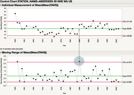
There appears to be a significant shift that occurs around 1985 for Aberdeen station. Notice the point above the control limit on the moving range chart, then all the monthly data points stay above the green average line in the individual chart. I tend to not believe the first data point or two (1958) in new data sets as equipment and personnel may not be following methods correctly. But I do believe something happened with the equipment at this station around the 1985 time. This is not evidence of a warming trend but a significant shift from a specific date or event. For example, maybe someone would have evidence that around this time frame, Aberdeen moved their measurement equipment or installed new sensors.

The remote area north of Fargo North Dakota, shown above as Ada Minnesota does not have any statistical evidence of a warming trend.

There is no doubt about this chart, there is a trend appearing for Barrow Alaska. The local residents can easily confirm this as the ice has retreated further and further away from the water banks of the town each year. As stated before, there is no doubt that ice regions are shrinking and this data confirms in areas at ice boundaries, temperatures are increasing as the ice is retreating further away.

Georgia east coast is not showing any statistical signals for a warming trend.

The east coast of Michigan has the beginning signs of a potential trend. We notice two points below the control limits to the early years and one point outside around the beginning of 2000. We also notice the majority of points below the mean to the early years and the majority of points higher than the mean in the last 20 years. While this is a faint signal, it cannot be totally dismissed. The year to year changes though are much larger than this potential 2 degree change over the last 100 years.

There is no evidence of a trend appearing in Northern Maine. There may have been a cooler period in the Mid 70’s to Mid 80’s as about 80% of those points are below the average, but the last 20 years are in line with temperatures over 80 years ago.

Nevada City shows a couple problems with data. Around 1975, something significant happened to create a large difference in the data. A 5 degree shift in temperature has occurred since that specific year. Potentially in the last 4 years, something significant has happened again. More questions should be asked about the location and type of equipment taking this data.

The last data set for Saint Anthony in Minneapolis shows no significant trend over time.
While I am not a political proponent one way or the other in support or denial of global warming, I think it is a good exercise to look at raw data and simply draw my own conclusions.
A concept of debate. Could it be as simple as the plate with a piece of ice on it sitting inside a refrigerator? At some point the plate with the ice will reach the set point temperature for the refrigerator. The area next to the ice will be colder and as the ice melts, but over time, those areas do rise in temperature and trend toward the set point of the appliance. At some point, the ice will be melted. What if the earth is simply going back to it’s natural state and some areas are already there? Are we heading to Temperature Equilibrium or is the Equilibrium simply a normal fluctuation cycle that we are already in?
Want training on this type of thinking or analysis? Check out www.dmssigma.com
Want training on this type of thinking or analysis? Check out www.dmssigma.com
No comments:
Post a Comment